

Peach Lunch Delivery
Crafting a quality lunch experience from restaurants you actually like
PEACH
Background
Peach delivers lunch from your favorite local restaurants directly to your office's front desk between 12:00 – 12:30 pm every weekday. The daily dish, rotated daily from restaurant to restaurant for variety, is texted to you every weekday morning. To place your order, simply respond "yes" to that text. The service is run primarily through an SMS/MMS texting model with web counterparts. Businesses and delivery drivers have apps to use.
My design methodology at Peach was straightforward: requirements discussion, low fidelity review / prototype, high fidelity review, develop iteration 1, test if possible, future iterations if possible, launch. Some projects had turn-around in 1 day or less and others longer, so we made this methodology modular to adjust to the project at hand. Feedback was gathered at each step.
PEACH
Sign up flow
We designed the sign up flow in three iterations. The goal was to lift funnel conversion rates.
The original design we were revising separated each step out over multiple screens. This felt unnecessarily long and requesting information flatly. I also felt we could do a much better job of engaging users and concurrently educating them about the service.
I proposed we adopt a gradual engagement approach in the sign up flow (i.e., have users experience portions of the product as they sign up). After researching the pattern (e.g., Twitter’s usage and how it increased sign-ups by 29%), I believed this approach was appropriate for us and would increase engagement as we desired while also educating users about the service.
We scoped the project to the preferences section of the sign up flow to start due to time and resources.
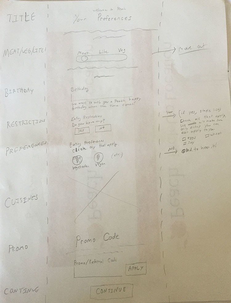
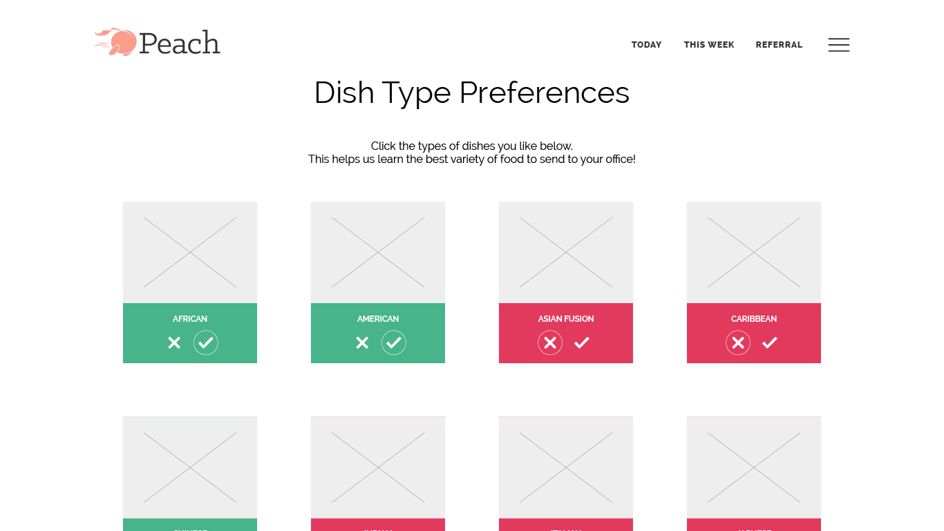
Iteration 1 was a quick sketch and wireframe to start the conversation. Consolidate preferences to a single page and add form fields for information we wanted to collect.
Iteration 2 attempted to scope down requested information to only favorite dish types. We collectively felt this over-pivoted and that the additional questions were beneficial enough to warrant them. (The UX could also have been simplified.)
Iteration 3 allowed us to guide users through the preferences section of sign up and made the step’s intent clearer. Users now had messaging to let them know where they were in the flow, the ability to skip some questions and answer them later, and an explanation of how these preferences worked in the service. This design accomplishes as much of the gradual engagement process as we could accomplish for this section given time and resources.
SIGN UP FLOW ITERATIONS
From sketch, to radical idea, to a balanced idea—we explored a spectrum of possibilities for this project.
PEACH
Building activation
Peach requires a certain number of users to begin lunch deliveries to an office. This page is shown to those users when they’ve signed up for Peach but their office needs more users to start delivery. The goal was to provide status and incentivize users to refer others to sign up.
Priorities were (1) have quick, obvious CTAs, (2) pronounced progress indication, (3) reward milestones. I designed the milestones to be malleable so business development could change the rewards and quantity.
I created the visual design while keeping it in line with other styles used on the site.
Building activations were lifted as a result of this work, meeting our goals.

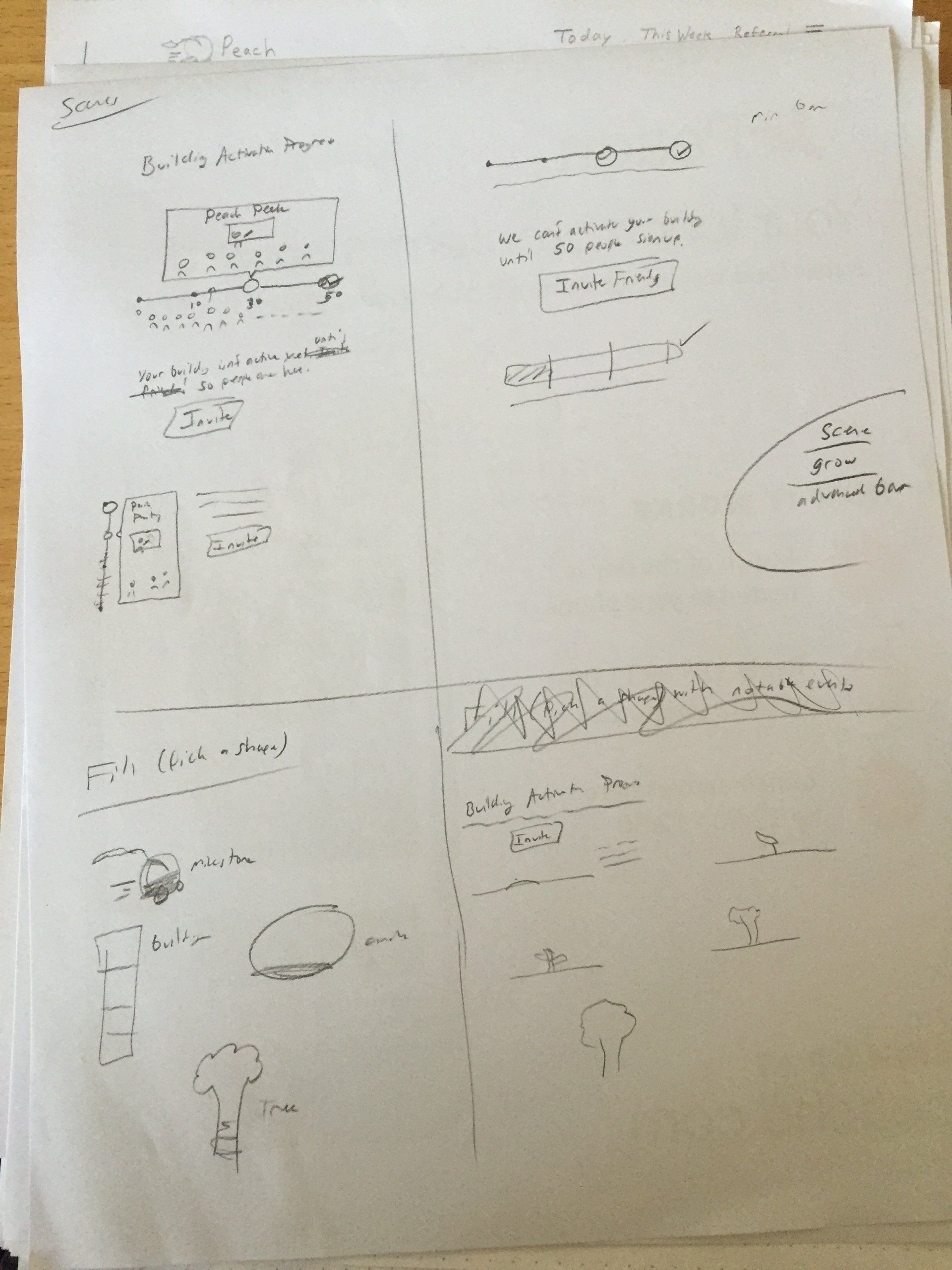
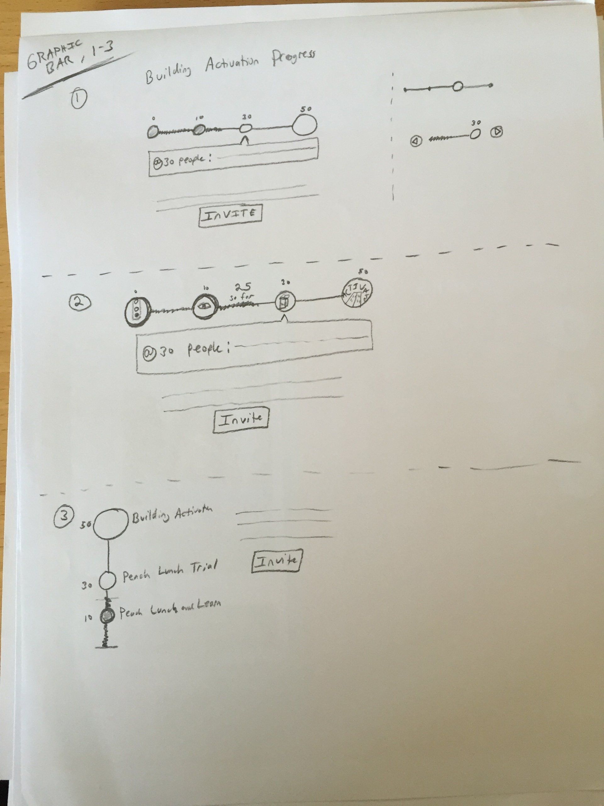

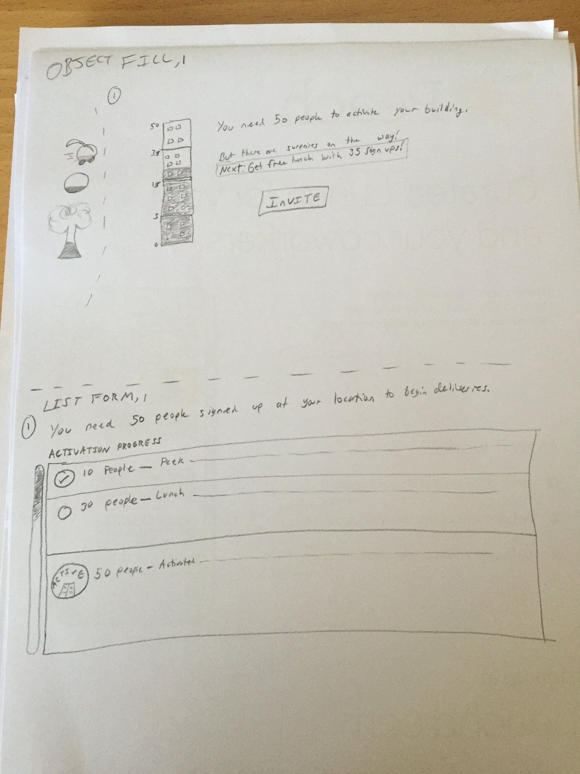
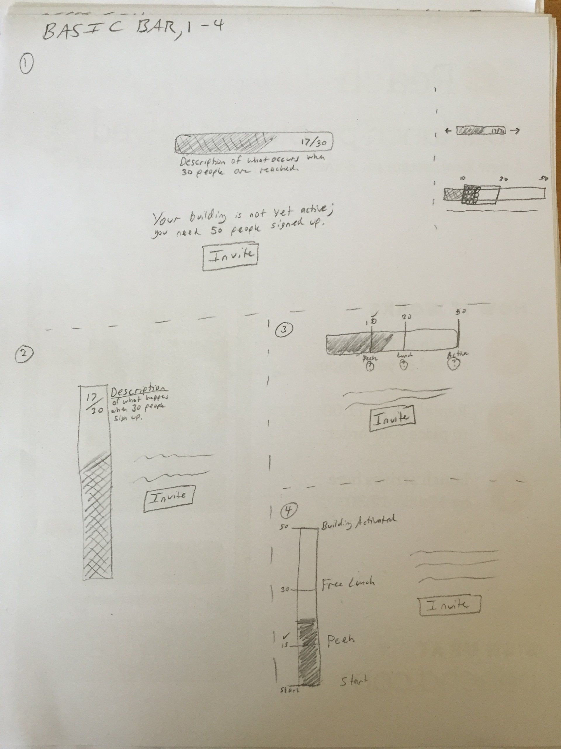


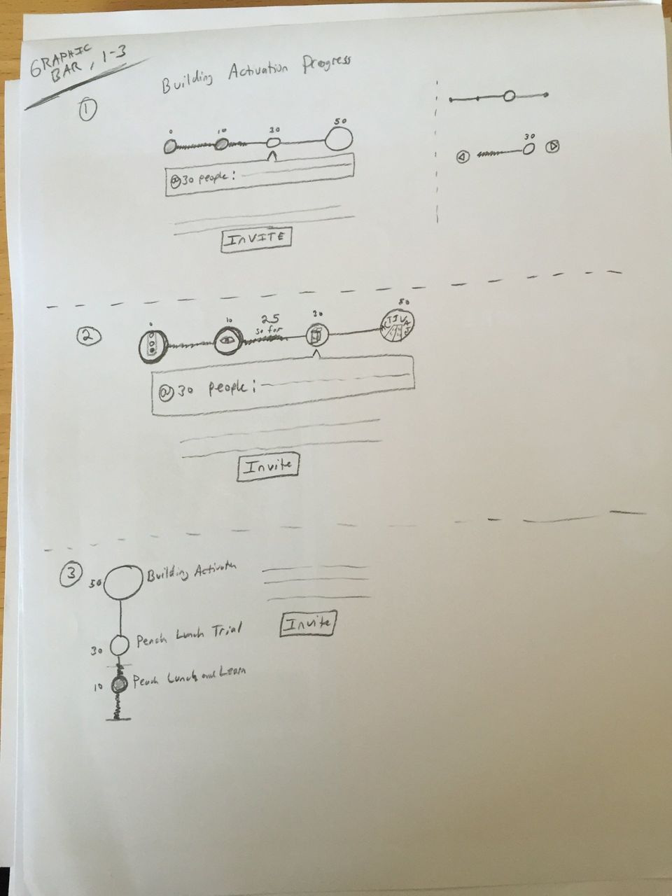
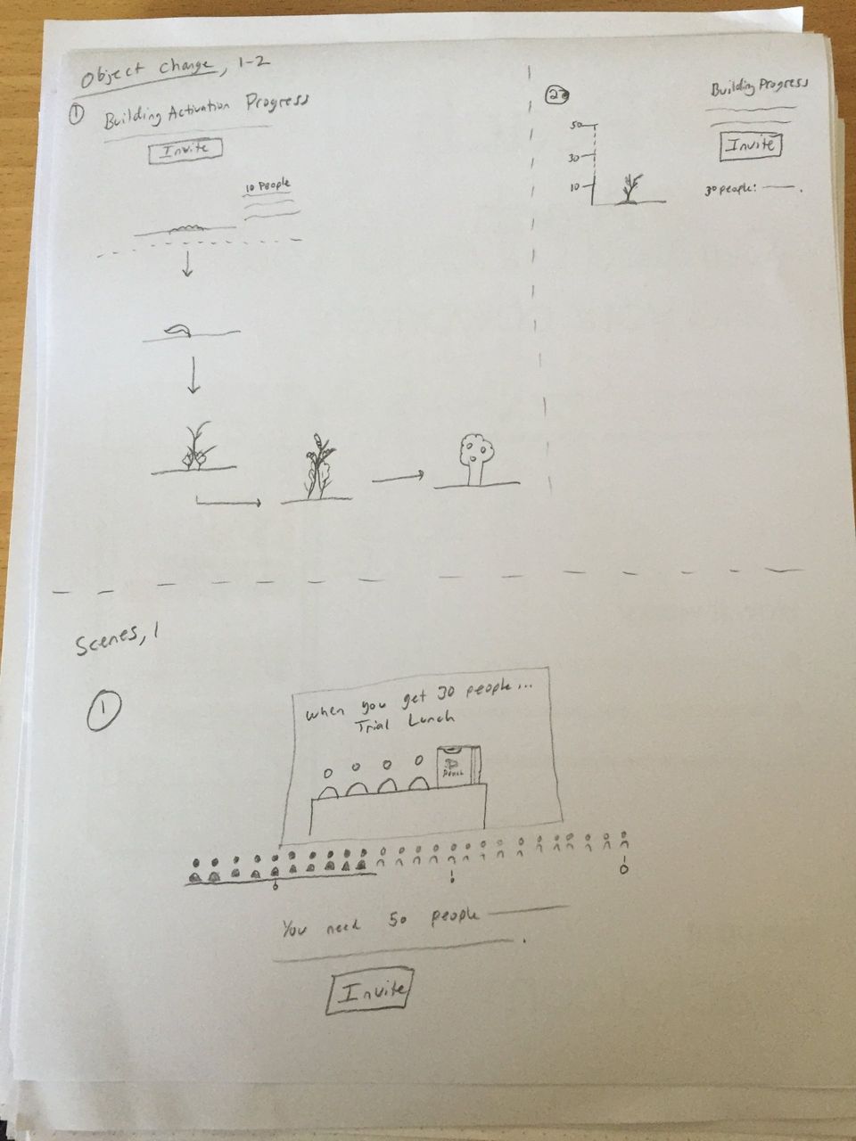
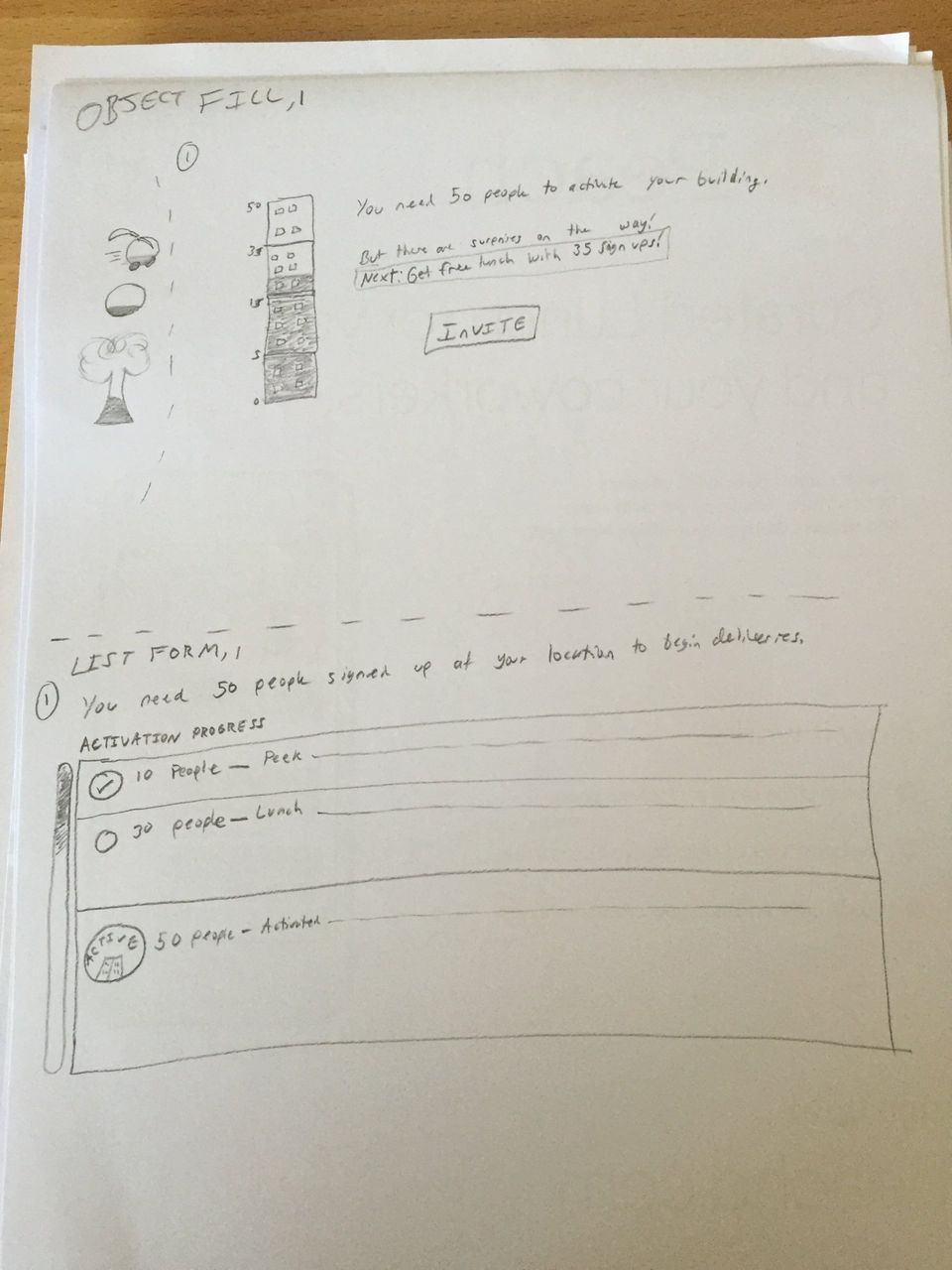
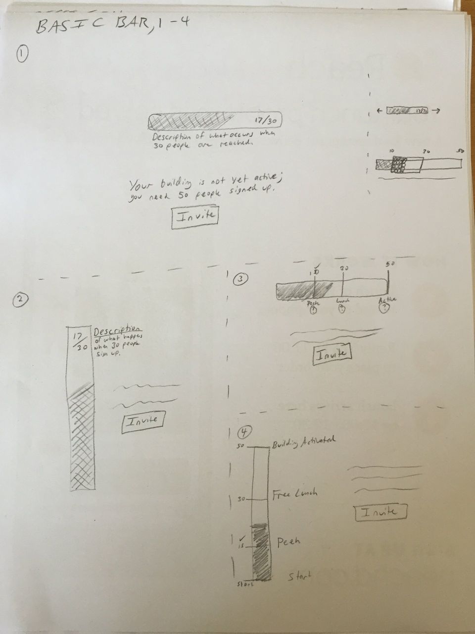
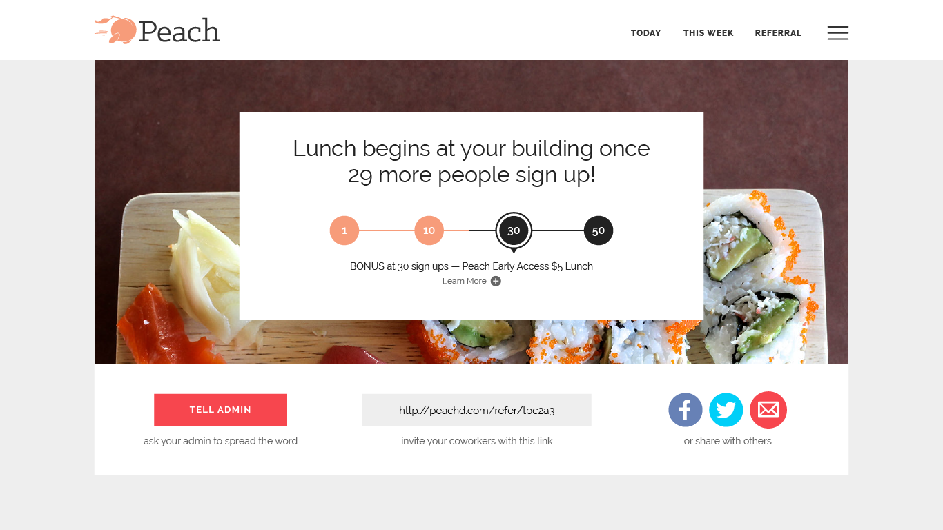
BUILDING ACTIVATION SKETCHES AND RESULT
I explored various concepts for how the building activation page could behave. The result empowered business development and incentivized our users.
PEACH
Building landing page (concept)
I designed a landing page that users interested in joining Peach at their company could access. The previous landing page was generic and offered little context about what food was being delivered to the company, a critical selling point.
We kept our goals simple and focused: focus on the food and simplicity of the service to convert quickly. We’d start simply and add as needed, based on the user information we had at the time.
We quickly laid out wireframes to agree on the direction.
Once agreed, I jumped into mocks. We were already armed with existing data and collective assumption about which information was most valuable to portray. Generous amounts of white space, simple animations, and light parallax were utilized to provide contrast to the intentionally minimal design.
The page’s flow was intended as follows: (1) see appetizing food tied to the building you work in, (2) single, obvious CTA, (3) crisp, clear, concise explanation of the service, (4) additional examples of food.
In retrospect, I would have added a few more selling points, include mouth-watering food photography set within a scene at the top of the page, and cleaned up the bottom section. Again, this was a concept.
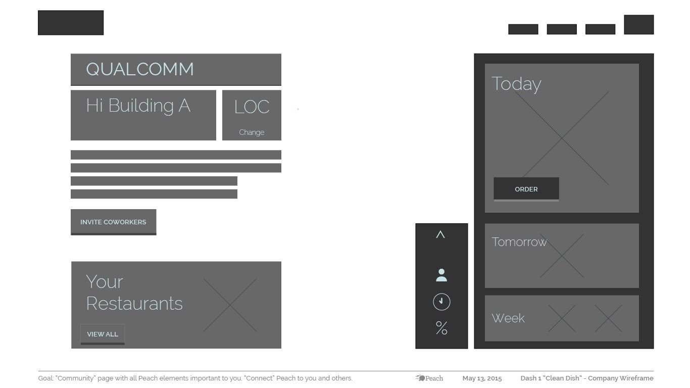
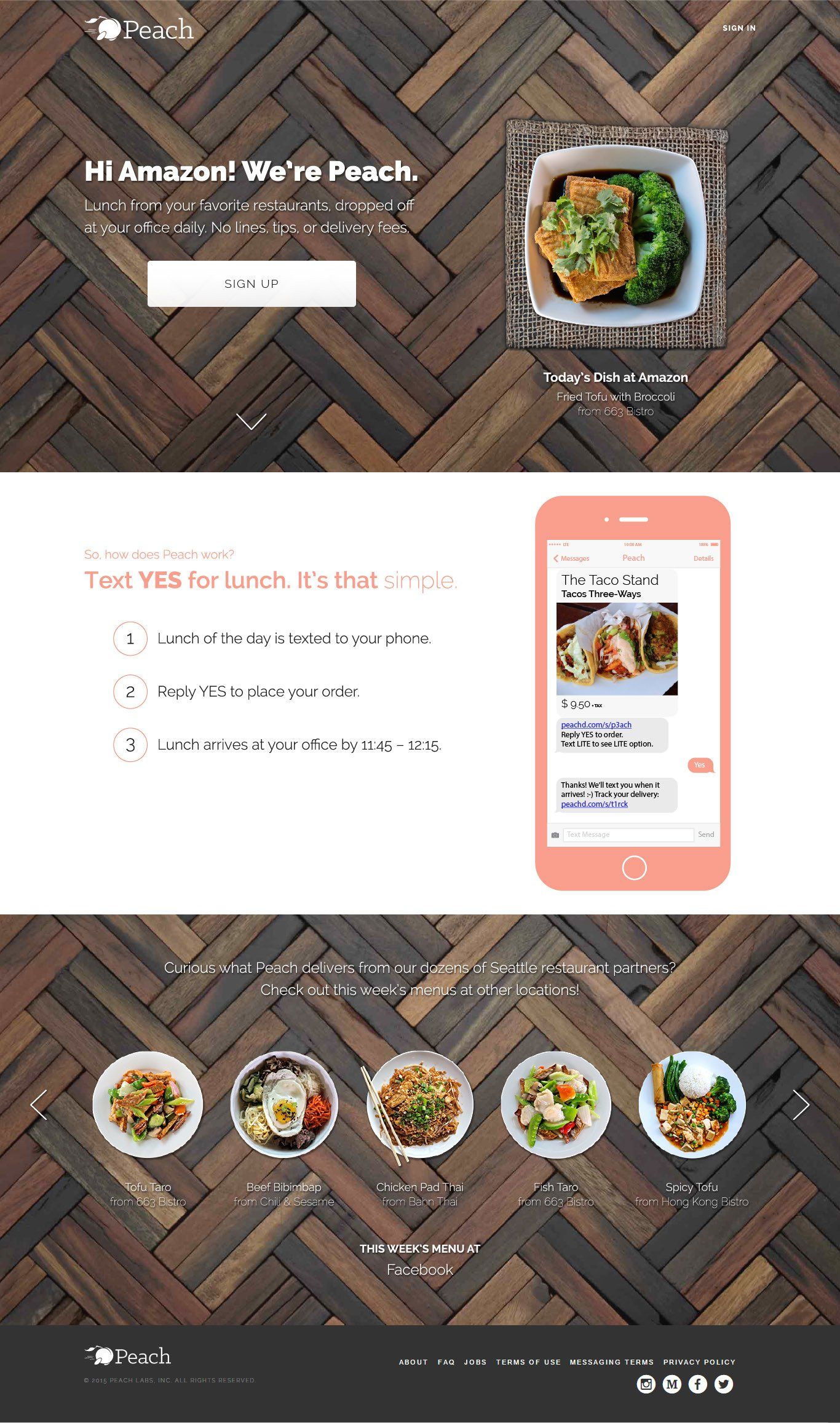
Photo By: John Doe
Button
COMPANY LANDING PAGE CONCEPT (CLICK TO SEE FULL)
A redesign of the existing company landing pages to inform users of the service and help them reach the sign up flow. These were often reached through marketing campaigns that gave additional context.
PEACH
Style guide and collateral
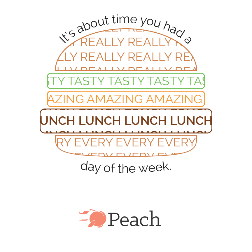
I created collateral for various company initiatives, including posters, conference banners, T-shirts, MMS, and sub-brands within Peach. I also created a basic style guide that consolidated and explained the brand as it existed to date.
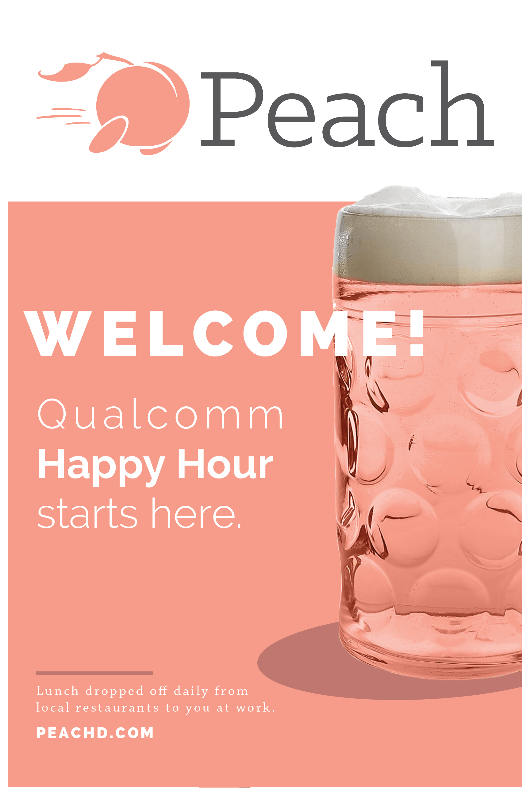

VARIOUS COLLATERAL (SOME COMPLETE / SOME IN-PROGRESS)
These are a few examples I could find in what I'd saved (the bottom two were in-progress). I created quite a bit of collateral, usually on-demand with little notice.